Fixing a bad AI project
I recently received a rather amusing request with a tight deadline. The task: to develop an educational web platform for computer courses at the V.G. Belinsky Library in Sverdlovsk. The target audience was older adults (55+).
But the funniest thing about this project was its context. It was the final assignment for an entire group of students in the course... drumroll... "Artificial Intelligence".
You'd think the name of the course alone would literally scream: use neural networks, generate code, optimise processes! But no. It turned out to be easier for the group of 20 people to chip in and hire me than to try to figure it out themselves or even write a decent prompt for ChatGPT.
"Masterpiece" UI/UX, or How Not to Design for Grandmas
The design and user flow, which were solemnly handed over to me by another part of the team, deserve a separate paragraph. I'll be honest: I wanted to cry.
It was a classic example of designers drawing pretty little buttons in Figma, completely forgetting about the people who would actually be using them. Confusing logic, unnecassary steps, and - the carry on top - a mandatory registration system and personal accounts for the 55+ audience. Nothing deters an older person from learning quite like the requirement to come up with a password and confirm an email address.
 My face when I first opened their UI/UX mockups in Figma
After taking a look at this flight of fancy, I realized I needed to mentally toss the brief in the trash and redesign the UX from scratch, using common sense.
What was done (and how it should actually work)
- We scrapped registration and profiles. I made the platform completely open. Grandma clicks the link - Grandma watches the lecture right away. No barries.
- A "fail-safe" interface. I redesigned the navigation: visually separated the menu from the content cards, cranked up the contrast, and created huge clickable areas. On smartphones, elements take up 100% of the screen width to prevent misclicks.
- SPA built with pure JS. No heavy frameworks or workarounds. Thi site opreates as a Single Page Application: screens switch instantly, without annoying page reloads.
- Progress saving "under the hood". Since we eliminated the backend with profiles, I wrote testing logic that saves quiz results directly to the browser's
localStorage. Once a user passes a test, their score (e.g., 2/2) is neatly displayed on the course card and doesn't disappear. - Data-Driven Architecture (foolproof). I knew that the content for this site would be added by the very people who couldn't write it themselves. To prevent them from messing with the HTML and breaking the layout, I moved the entire database of lectures, tests, and links into the
data.jsonconfiguration file. Now the site works like a builder: you add text to JSON, and the script automatically generates a responsive page from it.
Try It Yourself
Want to see what it's like to be a grandparent learning to use modern technology? Click the link and try out the platform for yourself: stornov.github.io/library-education-hub
Try taking a test or finding a lecture - that's the best way to understand why I focused on large buttons and minimizing unnecessary clicks.
Before & After: The UX Revolution
To better understand the scope of the work, take a look at the difference between the initial design and the final result.
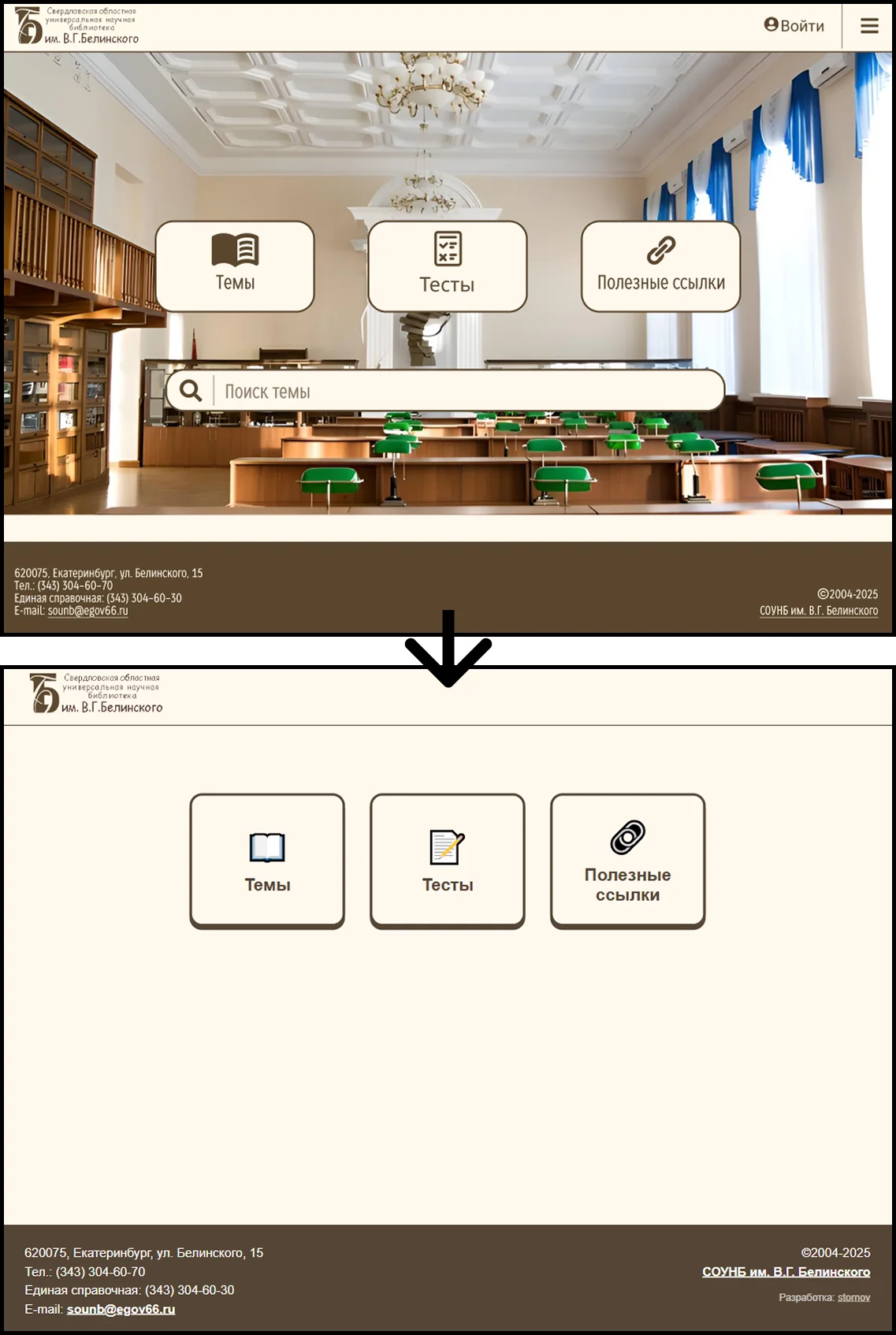
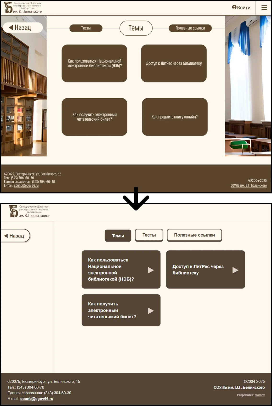
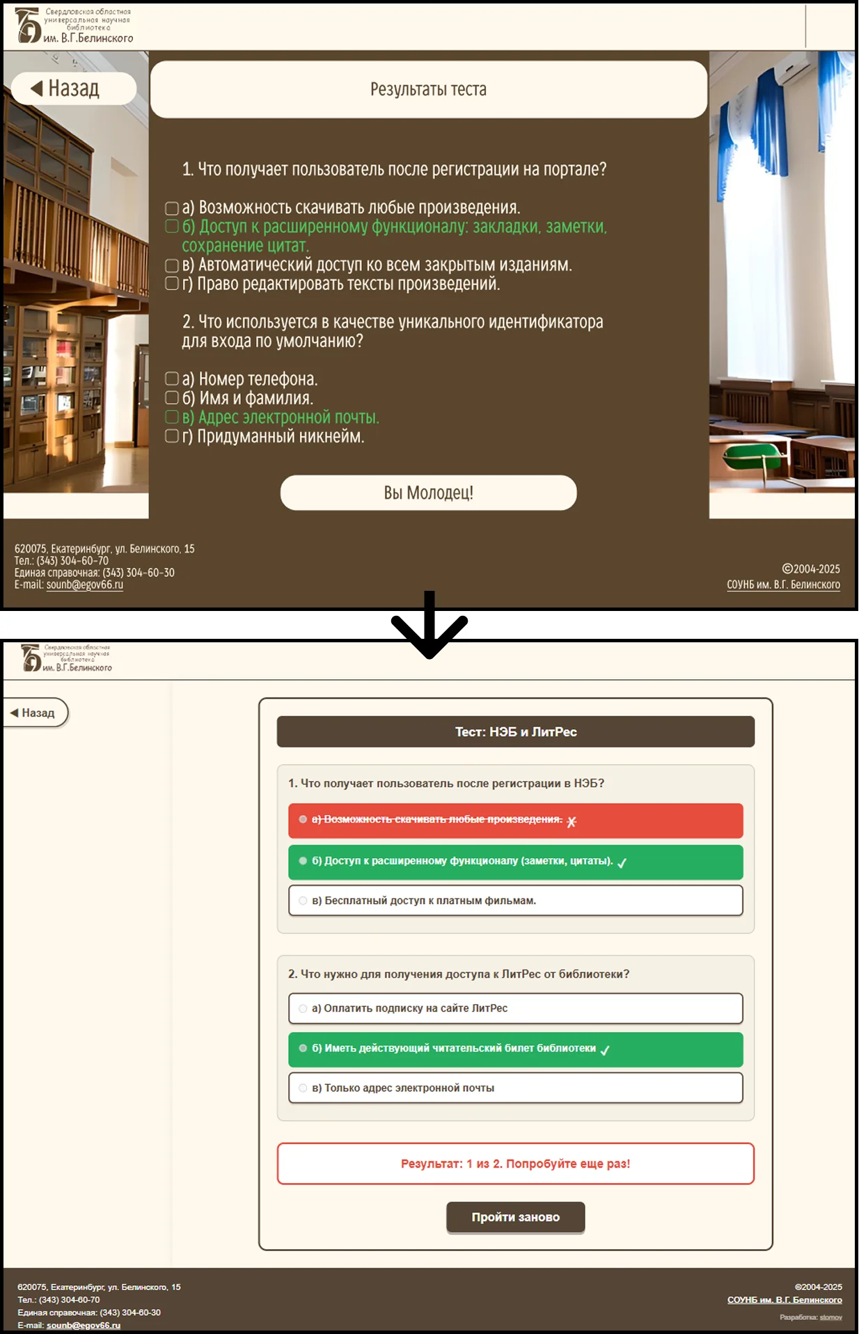
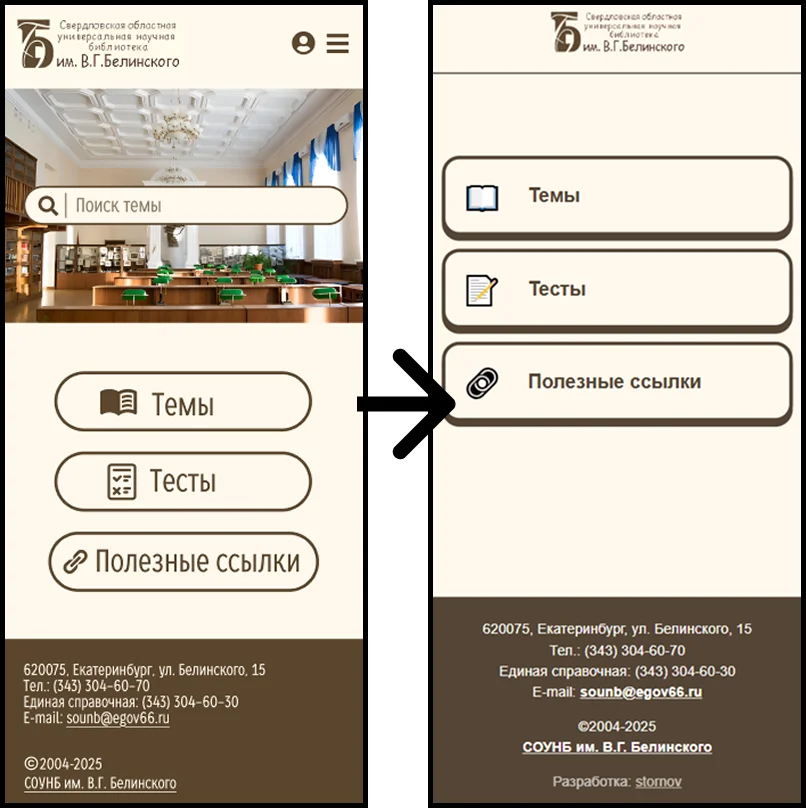
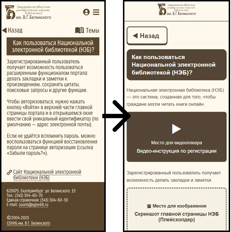
What changed:
-
UX focus: I removed "clutter" and barriers, transforming the confusing interface into a linear flow: enter - select - gain knowledge.
-
Accessibility: Instead of tiny buttons that are hard to hit, I created large, finger-friendly elements that are intuitive even for first-time smartphone users.
Conclusion
While some are enrolled in an AI course, too afraid to write a single line of code and designing unworkable interfaces, others put their minds to work, fix the mistakes of those so-called designers, and build sound, scalable architecture.
The result is a fast, lightweight, and truly inclusive product for the library - one I'm not ashamed of. And I took my money with a clear conscience.